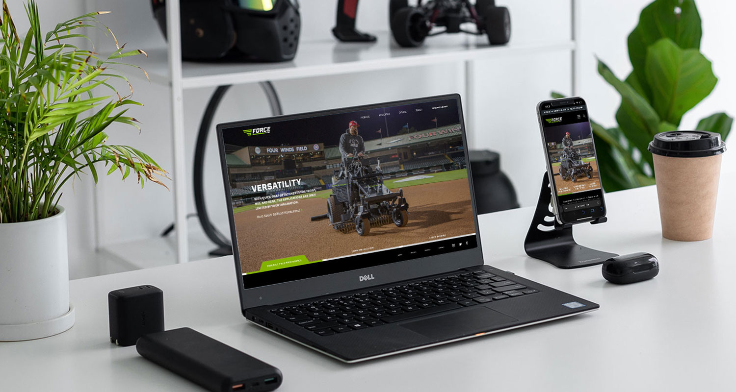
Force Website

The first major project in building the Force brand its own presence in the market was a new standalone website. We knew that getting this right would give the growing Force product line the foundation it needed to reach the its full potential.
Since we were trying to tell the story of a fairly complicated product and the supporting attachments, it was essential that we get the information architecture correct. We also wanted to build the site to be positioned to build the best SEO possible and to also be scalable for future planned product launches.
Once we had the site map nailed down, it was then time to get the framework for the site in place. Since we had a number of stakeholders that had never been through a complete website construction process, it was important to build out an interactive wireframe of the entire site to get understanding and buy in.
With the site structure and wireframes in place, it was time to start building out the high fidelity layouts in Figma. The designer and the content writer worked together in Figma to create the front end and UI design of all the pages and populate them with messaging and copy.


